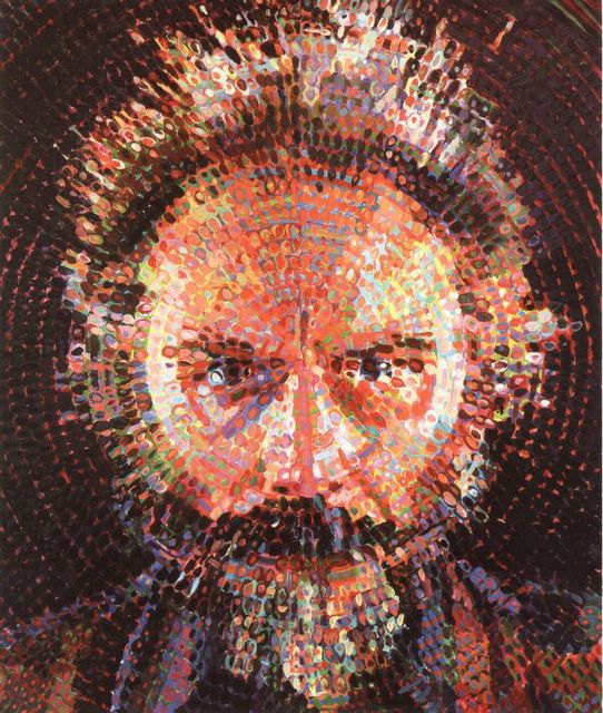
Tuesday, 19 February 2013

Vincent Van Gogh


Self Portrait
Vincent Van Gogh was born on the 30th of March 1853 in Zunder Netherlands and died on the 29th of July 1890 from a gunshot wound which was believed to be self inflicted. He was a Dutch impressionist painter, who like many great artist, was thought to be crazy. He was thought to be a strange artist because of how he did things to himself mostly prompted because of his metal illness.
He didn't always think he was going to become a painter. At first he believed that his work was to be in the church. He worked as a missionary in  Belgium where he began to sketch people from the local community.
He is well known for his amazing portraits which describes a lot about hime self. For one there is no expression on his face in any of his portraits. What is being portrad in the picture is not the main subject of his art, it is how he created all of his pieces in his own style. The way he is able to add depth and life like qualities to his images is the way he uses his brush strokes. The colours which many believed he used consisted of earthy colours.

It is believed that when he went to Paris where he was able to acquire knowledge of the French impressionist. 

He was not born a painter. He had only started his work until his early twenties. Within his decade of proffesional painting he was able to create over 2,100 pieces of art which made up of water colours, prints, drawings, sketches, and oil paintings.

What I like about his paintings is that they are quite detailed in a sense that from the tiny marks he makes really builds up towards a bigger picture.
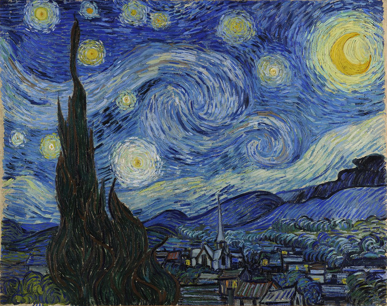
Stary Night


David Hockney

David Hockney was born on the 9th July 1937 in Bradford. David Hockney is gay doesn't have a problem with people knowing. His sexuality may of had some effect on his work, just like Andy Warhol. He is mostly known as an artist because of contribution to the Pop Art movement. He studied at the Royal College of Art in London. 

David started making his photo collages in the early 1980s. He labelled his work as "joiners". He made these collages by taking the photos with a Polaroid camera. Using Polaroid photographs of a object from different perspectives he was able to generate them together into a distorted image of the original. One of his first joiners was of his mother. Because the photographs are taken from different perspectives and at slightly different times, the result is of his work became a photographic version of Cubism.

We as a class looked at his work to gain more inspiration for our portrait project. We were able to mimic his work virtually using the same method as he did. The only difference in are method was the change from a instant image Polaroid to a digital camera. I found his work to be a real easy way to produce a cubist piece.

Monday, 18 February 2013

Chuck Close

Chuck Close was born on the  5 of July 1940 in the city of Monroe. He studied at the university of Yale and the Yale art school in 1964. He is mostly known for his portrait art but also has art made by photography.
His portrait work to me is very realistic and detailed. He does his work by using gridded photographs. He creates each of his paintings by applying one careful stroke after another in multi-colours or grayscale. Even after his life threatening spinal artery collapse1988 which has left him severely paralysed, he continues to paint and produce his work.


The reason why we are currently looking at his work is because of his grid style painting. We are integrating and trying to understand his work for our portrait project. Using his specific style will help us individually work on our own painting style. Later on in the course we will be looking at his other work as well.
The way we used his style with our own images took three stages of producing. First by taking a picture of our self and printing it out A3 size. Next step was two draw a criss cross grid onto our faces. The last step was to then paint each individual diamond to create a fully painted image with different colours.

Tuesday, 12 February 2013

Pablo piccaso


Pablo Picasso
Pablo Picasso was born om the 25th of October 1881 in Malaga, Spain. He sadly died at the age of 91 On the 8th of April 1973 in Mougins, France. He is known to the world as one of the greatest painters who ever lived. His work is mainly Cubist paintings and sculptures made from.
This painting is probably my favourite Picasso because it is the first  piece of his work I actually went into detail on and researched. If I was to copy this painting I would find it quite hard. Not only because of the use of abstract blended colours it is also because I do not understand the rules or qualities of the Cubist style of art. From my first glance of the piece I thought I was looking at a man drinking, but after being told what the image is really I can see it clearly.
The main reason that I am looking at Pablo Picasso  is because of his contribution towards the Art Movement known as Cubism. 
 
At the moment as a class we are resaeching on Cubism so we can grasp a better understanding of it so we can integrate are own work with it. Picasso's style of Cubism is a little different from the one we used and different from the original style of Cubism which he he gathered from african art .
Picasso's stlye shared the same concept of cubism which was to create an image that showed different view points of the human form. His style is different from the that we used.

David Carson


David Carson  was born on the 8th of September in1954. He is known as someone who broke the rules of typography. His work is based on how if something is not legible it can still communicate and still be understood.. He is well known for his  magazine designs, and posters.  He was the art director for the magazine Ray Gun.
 
 Looking at this piece of his work I can see that it has his specific style of graphics. He has a mix of edited letters to make up his background. The message which I think he is trying to get across in this image what is exactly is in the title. His work has broken the mold for what is legible what what isn't.I think that as long as his art has a meaning it is legible even if the words aren't.
This particular image was one of the few used to describe his interview where he is described as 'The King of Typography'. The  subject of the image being that with the help of technology he has been given a new way to communicate his ideas and make his work.


I quite like this piece of his work not only because of the way that he final piece came out, but because I can think of how he was able to produce something like this. Even though that most of the words in this aren't legible, the message is very clear. He is boasting the fact that he was one of the first people who broke the rules of type and was successful.


This is propbrably on of my favorite peices of his work because of the many use of enlargment and colour. By using these techniques anyone can make there work look like his. I think that this specific piece is advertising.


http://www.thisismyhead.com.ar/wp-content/uploads/2010/09/davidcarson-big.jpg

Tuesday, 29 January 2013

Verdana

Verdana is a  sans-serif typeface which was designed by Matthew Carter for the Microsoft Corporation released in 1996. The name "Verdana" is based on Ana Howlett's eldest daughter and verdant meaning something green.Verdana was designed to be readable at small sizes on a computer screen


Wednesday, 23 January 2013

San-serif an serif


Typography ranges from the history of the western alphabet to different fonts. Fonts come under san-serif of serif.
San- serif is the type of font which dosen't have little curves or extensions on the letters.
The reason that there is sans infront of it is because the word means without.

 
There are also different areas which come under fonts. Things which relate to letters such as x-height, acsenders, decsenders, and kurnings.