Film Title Sequences
1 What is the title of the film and (very briefly) what do
you think the film is about?
The title of the film
is “Magic trip”. From watching the video and reading the caption I am able to
gather that it is of about a group of hippy friends on a road trip in the
1960s.
2 Who are the designers of the sequences? – This may be a
company or an individual
Karan Fong who is a part of Imaginary Forces was the person
who designed the many titles and sequences in the trailer.
3 How have the following media been used and what effects
have been obtained or created by their use?
In these particular title sequences there is a lot of use of
screening and scans of drawings on top of a clear film. They have created a
graphical layering effect on top of the freeze frames.
4 What do the sequences communicate to you or the audience?
The sequences portray the characteristics of each individual
person through graphic drawings and imagery. Such as in the second last image
they have used cigarettes to represent their drug use. This also shows
reference to the life of a drug using hippy.

1 What is the title of the film and (very briefly) what do
you think the film is about?
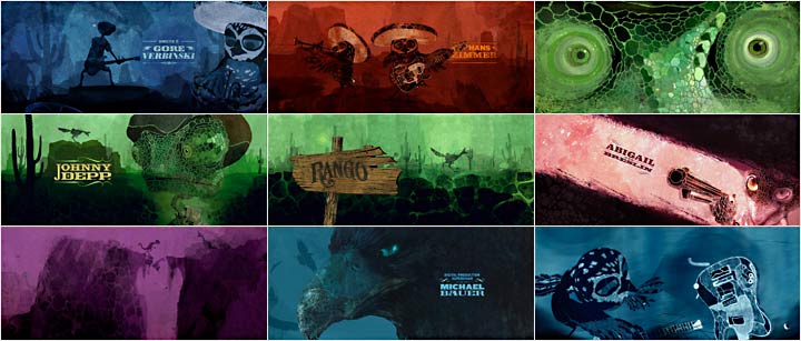
Rango is the name of
the film. From looking at the film sequence I gather that the movie is a
animated western which is aimed at a young audience because of the switch from
humans to animal characters.
2 Who are the designers of the sequences? – This may be a
company or an individual
The designer of the film end sequences is Henry Hobson. As
well as making the Rango title sequences he has also directed a viral teaser
for Resistance 3, and lately titles for 'Snow White and The Huntsman'.
3 How have the following media been used and what effects
have been obtained or created by their use?
The style is supposed to founded on the 'old school'
analogue hand work, such as intricate illustrations, woodcut art, and hand
drawn typography. I think that each one
of the slides has its own monochrome color effect.

4 What do the sequences communicate to you or the audience?
The sequences was presented at the end of the film has a add
on to the credits. It was seen as a total recap of the movie.
1 What is the title of the film and (very briefly) what do
you think the film is about?
Juno is the name of
this movie. Looking at the title sequence the story of the movie is a little
unclear. The story is about a girl dealing with teen pregnancy.
2 Who are the designers of the sequences? – This may be a
company or an individual
Shadowplay Studio, who made the title sequence, was a motion
graphics and visual effects studio founded by Ari Sachter-Zeltzer and Gareth
Smith. Gareth Smith and Sachter-Zeltzer were graduates from the design
department of UCLA. The studio discontinued in 2011. Former Shadowplay
designers Gareth Smith and Jenny Lee started Smith & Lee Design in 2011.
3 How have the following media been used and what effects
have been obtained or created by their use?
The pictures of the
girl looked as if they were photocopied and then scanned again. To achieve
sequence there was over 900 images of printing, hand-tracing, xeroxing, cutting
and coloring of the main character Juno MacGuff walking through her neighbourhood.
It seemed to me to be a job which should took a lot of time and patience.
4 What do the sequences communicate to you or the audience?
The sequences show the names producers screen writer and a lot of other people who took part in the
making of the movie. I can't really tell if these particular sequences reveal
anything specific but the fact that Juno is the name of the main character and
who that is.


