Wednesday, 22 May 2013

Desktop publishing


Desktop Publishing Revolution 1985
 Which companies started the Desk Top Publishing revolution in the mid 1980s?


The ‘desktop revolution’ of Graphic design and Typography began in 1984. The three small but prosperous companies Apple, Adobe and Aldus were responsible for the new technology.

 Aldus was a software company that developed desktop publishing software. It was founded by Jeremy Jaech, Mark Sundstrom, Mike Templeman, Dave Walter and man named Paul Brainerd. He was born in 1947 and during his life he became a master in the areas of computer-aided editing, design and publishing. The company itself only lasted for 10 years but a specific three men who left Aldus in 1990 became the founders of Visio Corporation. That company then created a product which later became known as Microsoft Office Visio.

 Adobe systems were originally a company which focused upon the creation of multimedia and creativity software products. Today it has now broken its original boundaries and is now subjected  towards making  Internet application software development. The company was founded by John Warnock and Charlse Geschke in December of 1982. Quite similarly both these men created their company after leaving their previous occupations at Xerox PARC. Their main goal in creating adobe systems was to develop and sell PostScript page description language.

 As Adobe, Apple was also a California company. Apple was created on the 1st of April, 1976, through the efforts of Steve Jobs, Steve Wozniak and Ronald Wayne. Their main objective was to sell the Apple 1 which was personal computer kit. The kits were hand-built by Steve Wozniak.I believe that their goal at the time was to create a new processing centre for business work storage and for the average Joe to enjoy himself. There was new technology for new purposes.
•What products did they launch?
Aldus was known for its creation and development on the PageMaker application, an early product in the desktop publishing field.
The PageMaker was released during July of 1985, and relied on Adobe's PostScript page description language. i also required the use of Apple's LaserWriter, a PostScript laser printer. PageMaker for the PC was released in 1986, but by then the Mac was already the de facto DTP platform, with Adobe Illustrator released in 1987 and Adobe Photo shop released in 1990 completing the suite of graphic design software.
The switch to digital led to new forms of creative digital typography, graphics and publishing.
The Apple II was introduced on April 16, 1977. It was different from other new technology because its character cell-based colour graphics and an open architecture. Other early models used regular cassette tapes as storage devices, but they were made obsolete as there was the introduction of a 5 1/4 inchfloppy disk drive and interface, the Disk II. This made new ways of producing graphical and architectural work. It was also the next step in digital storage devices.

 •What was the result of these inventions on:

Workers in the traditional print industry?

The new technology made the old fashion traditional print industry obsolete and made a product which every company needed to buy.VisiCalc created a business market for the Apple II and gave people at home the environment of the office, this just gave people more reasons to buy an Apple II.

 The availability of information?
Anyone who had a computer at the time was able to research entire projects in one sitting. There internet was a new and more efficient substitute for the library, books and written questions.

 What was the opportunity to start up new newspapers and magazines?
People had more opportunities to say what they wanted in a cheaper and legal way. Things became more in detail. For example you could have a website for cooking making cook books useless. Using Apple and Aldus, new small magazines and newspapers came up independent of the old established publishing companies.
The impact on typography design was ?
 There was the launch of ‘Image Pro’ in 1988 by brothers Knoll, Thomas and Glenn. The idea was rejected by Aldus as it was ‘too gimmicky’. It was then adopted by Adobe in 1990 who renamed it Photo shop 1.0 for use on Apple Macs. It was a new age of digital typography design. It gave artist new tools to work with.

 How is text on screen different to text on print? Explain in full – why are some typefaces better suited for screen? Name one.
In typography, words in print the way that the eye reads it depends on  the light reflecting off the surface of the paper and into the reader’s eyes.
Typography on screen works with light that is emitted directly from the screen into the eyes.
Most typography is designed specifically to be readable at small sizes on a computer screen.

• What is typical of typography and text used on modern mobile devices?

 Since the 1990s Fonts on electronics are made up from using font creation software programmes such as Fontographer and FontLab. Using fontLab you are able to manipulate the font, kerning or stroke or any other attributes. Most fonts can now be bought online and downloaded instantly.


The characteristics of words on a mobile phone were changed. The x-height was moved 65 and 80% between from the cap height. The descenders are shortened and no ascenders above the cap height.


Thursday, 2 May 2013

Bauhauss


Bauhaus was a fine arts school in Germany which was funded and founded by a man named Walter Gropius. The school began in 1919 and ended in 1932. Bauhuas meaning house of construction. Walter Gropius was born on the 18th of May 1883 and died on the 5th of July 1969. He believed in the family business and became an architect at an early age. Although the man could not draw a straight line he was able to complete his designs and plans through the use of people who could draw. The school was famous for its new different modernist ideas.

The influence of Bauhuas spread developments in art, architecture, graphic design, interior design, industrial design, and typography.

 
Who was Herbert Bayer? What famous typeface did he design? Why did he and other Bauhaus designers invent  many ‘sans serif’ typefaces?
Herbert Bayer was born on the 5th April 1900 and died on the 30th of  September 1985. During his time on earth he was a graphic designer, painter, photographer, sculptor, art director, environmental and interior designer, and architect, who was widely recognised as the last living member of the Bauhaus movement. The reason for the multiple San-serifs created was to spread their new era of modernism into the typeface world.


Who was Laszlo Moholy-Nagy? Discuss his graphic style.

He was born on the 20th July 1895 and died on the 24th November 1946. He was a Hungarian painter and a photographer. He was also one of the professors at the Bauhaus school. He was inspired through the integration of high tech technology and the integration of art. Moholy-Nagy had an Art and Design university in Budapest was named in his honor. Throughout his life  he became a wealthy professional within his work of photography, typography, sculpture, painting, printmaking. His main field was photography. He believed that photography could create a whole new way of seeing the outside world that the human eye couldn't. He experimented with the photographic process of exposing light sensitive paper with objects overlain on top of it, he called it photogram.


 Who was Max Meidinger, What famous typeface did he design? discuss that typeface in more detail.
Max Miedinger was born on the 24th of December 1910  He was famous for creating Neue Haas Grotesk typeface in 1957 which was renamed Helvetica in 1960. He soon later became a typographer for Globus department store's  and became a customer counselor and typeface sales representative for the Haas’sche Schriftgießerei until 1956, There he became a freelance graphic artist in Zürich. He had created Helvetica to get rid of the old Gothic typeface face which was previously used. Helvetica is a sans-serif typeface. His goal was to create a clear typeface with no curves of any kind. So it didn't resemble any serif font. The name was actually changed so that they could market the typeface worldwide.

Tuesday, 16 April 2013

Johannes Gutenberg


• Johannes Gutenberg

 Johannes Gutenberg date of birth was seen as the year of 1398, but his death had the clear date of being the3rd of February of 1468 dying at the age of 70 years old. He died in the same place where he was born, Mainz, Germany which was seen as one of the most religious places among the Roman Empire. The place where he obviously used most of his time probably influenced his decision on making his second biggest achievements, the Gutenberg Bible.


•What is a Printing Press, how does it work?

 The printing press was the first machine man created to mass produce text on paper or cloth. It used multiple metal letters in assorted orders to form words which were then dipped with ink. With the help of pressure the letters left their mark of ink on the medium. A printing press ranged within the sizes of 5 to 7 feet long, 3 feet wide, and 7 feet tall.

 •When and where did Johannes Gutenberg invent the printing press.

Movable Type was the way in which Johannes Gutenberg was able to get his printing press to transfer the impression of each letter with oil based ink.  He used the same technique which people today use for making regular prints with ink. The date which Gutenberg invented the printing press was noted as 1450.

•What was the impact of the Printing press?

The impact of this new machine had created a new way of producing written literature. From the point and time before it was created everything was written by hand. After it had been invented it was of the most prized possession of the time. England at one point had their own printing press guarded in the tower of London. Although over time the printing press became easier to produce and less protected. The reason why the government had a printing press was so they could spread their own biased information through the newspaper. Gutenberg's occupation was being a goldsmith, which gave the work space and tools to create the printing press. The printing press made the old ways of making literature obsolete.

Friday, 1 March 2013

Wes Wilson


Robert Wesley Wilson was born on the 15 of July in 1937 in Sacramento California. He is known for being one of many the American artist who produced images of psychedelic posters. His work was mainly used to promote hippy music concerts of peaceful drug using gatherings.

It is also believed that like many other psychedelic artist, Wes Wilson was under the influence when he produced his artwork.

I like this image because I believe that it  shows the influence of drugs and very psychedelic colours. The main thing that I believe which stands out with psychedelic posters is that they are eye catching with a hidden message. Within his piece of the man he has put in hypnotising patterns and somewhat legible words on the side. What makes up most of his work is complementary colours. I believe that the way which he made his art was not done digitally but by hand.


Tuesday, 19 February 2013

Vincent Van Gogh


Self Portrait
Vincent Van Gogh was born on the 30th of March 1853 in Zunder Netherlands and died on the 29th of July 1890 from a gunshot wound which was believed to be self inflicted. He was a Dutch impressionist painter, who like many great artist, was thought to be crazy. He was thought to be a strange artist because of how he did things to himself mostly prompted because of his metal illness.
He didn't always think he was going to become a painter. At first he believed that his work was to be in the church. He worked as a missionary in  Belgium where he began to sketch people from the local community.
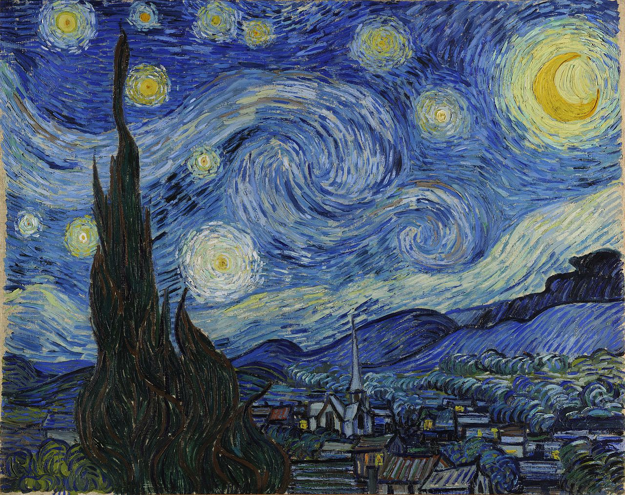
He is well known for his amazing portraits which describes a lot about hime self. For one there is no expression on his face in any of his portraits. What is being portrad in the picture is not the main subject of his art, it is how he created all of his pieces in his own style. The way he is able to add depth and life like qualities to his images is the way he uses his brush strokes. The colours which many believed he used consisted of earthy colours.

It is believed that when he went to Paris where he was able to acquire knowledge of the French impressionist. 

He was not born a painter. He had only started his work until his early twenties. Within his decade of proffesional painting he was able to create over 2,100 pieces of art which made up of water colours, prints, drawings, sketches, and oil paintings.

What I like about his paintings is that they are quite detailed in a sense that from the tiny marks he makes really builds up towards a bigger picture.

Stary Night


David Hockney

David Hockney was born on the 9th July 1937 in Bradford. David Hockney is gay doesn't have a problem with people knowing. His sexuality may of had some effect on his work, just like Andy Warhol. He is mostly known as an artist because of contribution to the Pop Art movement. He studied at the Royal College of Art in London. 

David started making his photo collages in the early 1980s. He labelled his work as "joiners". He made these collages by taking the photos with a Polaroid camera. Using Polaroid photographs of a object from different perspectives he was able to generate them together into a distorted image of the original. One of his first joiners was of his mother. Because the photographs are taken from different perspectives and at slightly different times, the result is of his work became a photographic version of Cubism.

We as a class looked at his work to gain more inspiration for our portrait project. We were able to mimic his work virtually using the same method as he did. The only difference in are method was the change from a instant image Polaroid to a digital camera. I found his work to be a real easy way to produce a cubist piece.

Monday, 18 February 2013

Chuck Close

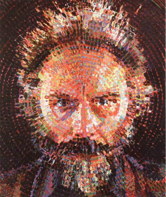
Chuck Close was born on the  5 of July 1940 in the city of Monroe. He studied at the university of Yale and the Yale art school in 1964. He is mostly known for his portrait art but also has art made by photography.
His portrait work to me is very realistic and detailed. He does his work by using gridded photographs. He creates each of his paintings by applying one careful stroke after another in multi-colours or grayscale. Even after his life threatening spinal artery collapse1988 which has left him severely paralysed, he continues to paint and produce his work.


The reason why we are currently looking at his work is because of his grid style painting. We are integrating and trying to understand his work for our portrait project. Using his specific style will help us individually work on our own painting style. Later on in the course we will be looking at his other work as well.
The way we used his style with our own images took three stages of producing. First by taking a picture of our self and printing it out A3 size. Next step was two draw a criss cross grid onto our faces. The last step was to then paint each individual diamond to create a fully painted image with different colours.