Tuesday, 12 February 2013

Pablo piccaso


Pablo Picasso
Pablo Picasso was born om the 25th of October 1881 in Malaga, Spain. He sadly died at the age of 91 On the 8th of April 1973 in Mougins, France. He is known to the world as one of the greatest painters who ever lived. His work is mainly Cubist paintings and sculptures made from.
This painting is probably my favourite Picasso because it is the first  piece of his work I actually went into detail on and researched. If I was to copy this painting I would find it quite hard. Not only because of the use of abstract blended colours it is also because I do not understand the rules or qualities of the Cubist style of art. From my first glance of the piece I thought I was looking at a man drinking, but after being told what the image is really I can see it clearly.
The main reason that I am looking at Pablo Picasso  is because of his contribution towards the Art Movement known as Cubism. 
 
At the moment as a class we are resaeching on Cubism so we can grasp a better understanding of it so we can integrate are own work with it. Picasso's style of Cubism is a little different from the one we used and different from the original style of Cubism which he he gathered from african art .
Picasso's stlye shared the same concept of cubism which was to create an image that showed different view points of the human form. His style is different from the that we used.

David Carson


David Carson  was born on the 8th of September in1954. He is known as someone who broke the rules of typography. His work is based on how if something is not legible it can still communicate and still be understood.. He is well known for his  magazine designs, and posters.  He was the art director for the magazine Ray Gun.
 
 Looking at this piece of his work I can see that it has his specific style of graphics. He has a mix of edited letters to make up his background. The message which I think he is trying to get across in this image what is exactly is in the title. His work has broken the mold for what is legible what what isn't.I think that as long as his art has a meaning it is legible even if the words aren't.
This particular image was one of the few used to describe his interview where he is described as 'The King of Typography'. The  subject of the image being that with the help of technology he has been given a new way to communicate his ideas and make his work.


I quite like this piece of his work not only because of the way that he final piece came out, but because I can think of how he was able to produce something like this. Even though that most of the words in this aren't legible, the message is very clear. He is boasting the fact that he was one of the first people who broke the rules of type and was successful.


This is propbrably on of my favorite peices of his work because of the many use of enlargment and colour. By using these techniques anyone can make there work look like his. I think that this specific piece is advertising.


http://www.thisismyhead.com.ar/wp-content/uploads/2010/09/davidcarson-big.jpg

Tuesday, 29 January 2013

Verdana

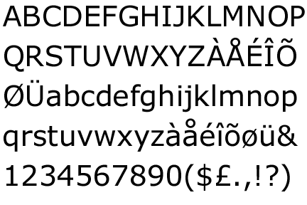
Verdana is a  sans-serif typeface which was designed by Matthew Carter for the Microsoft Corporation released in 1996. The name "Verdana" is based on Ana Howlett's eldest daughter and verdant meaning something green.Verdana was designed to be readable at small sizes on a computer screen


Wednesday, 23 January 2013

San-serif an serif


Typography ranges from the history of the western alphabet to different fonts. Fonts come under san-serif of serif.
San- serif is the type of font which dosen't have little curves or extensions on the letters.
The reason that there is sans infront of it is because the word means without.

 
There are also different areas which come under fonts. Things which relate to letters such as x-height, acsenders, decsenders, and kurnings.


Monday, 21 January 2013

Final evaluation x2


Final Evaluation-City Scape


We as a class were given a task to develop and complete a fully mounted city scape. The finished product would be a negative and positive cut out of a city design. The first thing we had to do was trace out of city designs. We could trace anything we found we liked. I found this task a little hard because of the composition of each building. The inspiration we had were the images in magazines. We also had our past work to refer to. I used perspective from my past work to influence my composition of my city. The idea was then to photocopy the tracing paper with the buildings.

After the photocopying was finished in A3 size we were able to start cutting out our images. We did this as if we were going to make a stencil. The goal was to cut the photocopies while they were on top of the black sticky paper. The black sticky paper was shiny but also smaller than photocopies. We had to then trim our original designs to fit the shiny black paper. For the positive and negative cuts we had the option of mounting them on black and or white paper, but for the photo copy cut we could use colour paper. The hardest part of the task i found was cutting the copy and black sticky paper together. this was because of the small detail were difficult to cuts. My paper cut was the only cut which i  felt failed. This was because after cutting the photocopy I felt it was to rough and not presentable. I thought my other cuts succeeded quite well in the end. The only thing I didn't like, at all throughout the project, was the amount of time it took to complete. If I was to change anything to make my city scape better would be the buildings. I think that I made the city scape harder for myself to cut with the composition.

Final Evaluation-Snowboard


The project goal was to make two snow board designs that could relate to us and some of the work in our sketch books. We were given examples for snowboard designs. I found that  the designs were quite bold and mostly words. For my experiments for my snowboard design mixed ideas together. We were told if we were to mix more than one thing we were to merge them together. For the start of my snowboard designs we made designs through magazine cut outs and drawings in the shape of snowboards. We also made prints which we cut for design ideas. The design for my 4 by 4 board design reflects a little of my snowboard design. I put the saints logo on the top front side of my snowboard. For the rest of my board I chose to incorporated a far perspective of a road going into a tunnel. This was an idea from my sketch book. For the bottom side of my snow board I chose to make a bold and simple design. This was because I felt most snowboard designs are like that. So I chose to design an opening which can seen as a zipper, but also can be seen as a reflecting city scape. For making our snowboard we were given a rough cut out of a snowboard made of foam. We used wood carving tools to shape the board correctly. First to prepare the board for painting we had to put a base coat of white piant down. We had to apply the white paint thickly so it could do its job as a base coat. Using acrylic paints I painted the design on the snowboard. Using a fine brush to paint it. For a realist snowboard touch I had the idea of applying a coat of lacquer to my snowboard for a hard plastic look.


 Orticoodles is the name of the work of Alita and Wally. They are pair of Italian graffiti artists who produce very amazing stencils through which they generate pop art influenced images that decorate urban walls, skate half-pipes and canvases. Most of their work being graffiti their art looks very professional. There work is quite expensive. It would be great to see them produce a set of silkscreens based on their stencil work, I might be able to afford one of those.

Sometimes the content of their work has the possibility to offend people. They know this as a fact and have the no intent in of ending anyone.


For more information on this group you can visit thier website

Tuesday, 18 December 2012

Zoe More O'Ferrall


Zoe More O'Ferrall
 

Zoe's ink drawings are drawn with fine pen and ink. In most of her work she incorperates photography and screen-printing. She looks at ordinary things such as architecture, objects, packaging and possessions to find inspiration. .She completed her foundation at Wimbledon School of Artwhich led her to do a BA at the University of the Arts LCC and a post graduate course in Illustration at Central Saint Martins.


This illistration is a ink drawing to advertise the show Skins. I like this piece of Zoe More O'Ferrall because of how she has incorperated everyday objects and patterns which relate to the characters on the show. She has also worked for other companies to advertise there work.