Thursday, 3 October 2013

Color

Francoise Nielly is an artist that I just came across looking for good portrait paintings. She is French artist who grew up in the South of France. The main tools she uses to make her art is a knife and her mind. These paintings are done with oil paints. Her work on her website is fuelled with her expressiveness of her 'brute force, a fascinating vital energy'. Her paintings are described as being 'sexual, her colours free, exuberant, surprising, even explosive'. What is said is when she paints she takes a risk.
To me oil paints are the worst because I find them hard to work with, more expensive than other paints and you need white spirit to get it off your hands.
I like the thick style and use of the oil paint. To me I feel like she has used the material and the knife in the best way possible. The colours that she has used in  this first picture I find to be vibrant and electrifying. She has shown the lights and darks in the faces by substituting the natural skin colours for brighter and darker versions. I think that is her style and has worked very well. The best colour in the picture I would say is the yellow. That part reminds me of reflectors like on bikes or on jackets which have the purpose of being seen. I think that she wanted her art to attract eyes and I thin k it has. To me I think that her technique of using oils and a knife to make these portraits is very hard and would be hard for me to preform. I think she has done her work on top of a table so the paint could drip dry.

I like this painting because she has used more natural skin colour on these people. To be honest I also like this painting because I can see that she can work with any type of person with any colour of skin or different facial features. I think the colour which stands out the most and has worked the best is the red. It seems that the faces blend or disappear into block colour background. I think that she has represented which parts of the faces are light and dark.
This painting I think is more realistic than the others. I also think that she has used more block colours to show flat areas. The focus point of this painting I think are in the eyes because they are the clearest thing in the painting. You can see that image from top to bottom started off as being neat but them it got more blurred. She  could be showing when you look at a person all that you need to see is their face or eyes. The eyes are known as the windows into the soul so the clearer they are in the painting the easier it is to see the real person.
I like this painting because of the use of purple to describe the shadows of the face and background. There is a little use of skin tone used in this painting and I think that, that keeps a little more realism to face. Even though the face is realistic the colours are bright and unreal which I think show imagination. A very creative imagination. That is one of the many things which is also said about how Francoise Nielly makes and tries to portray in her work.

Wednesday, 2 October 2013

Trip to Tate

As starting second year at college we went on a trip to the Tate National Art Gallery. The experience as a whole in my opinion was the same as any other art gallery. There were certain things about the art that I looked at  different than before. Now as I consider more than just the message of a piece of art. When I judge a piece now I take into consideration of technique and effort put into work. Most of the time when I used to go art galleries I would walk past a piece of art a think only about appearance and quality. It didn't matter to me if it took two weeks or two minutes. It didn't matter if I thought it had a meaning or if it didn't.

The important things I think of now is meaning to the art the time it must have taken to make it and the difficulty or ease.

The quality of art that I saw at the national gallery I think is much better than at the Tate modern. The Tate modern being much more contemporary and weird to me.

One artist that we looked at before that we saw more of at the Tate was John Constable. I found his work to be filled with detail and meaning. What I believe to be the meaning to most of his paintings was a personal and sentimental feeling. He painted landscapes of places of were he used to be live by.

    
John Constable
Salisbury Cathedral from the Meadows 1831
© The National Gallery, London
 
When I look at this painting what I see is a place were someone grew up in the past. A place filled with natural beauty.
On the Tate website this is described as just being the start of sublime art.
What story is being told is thought to be the after effect of a raging storm. To me what I see is a natural landscape which can no longer be seen today. The way in which the colour is captured in the painting to me is just described as being professional.
I think that they were other artist that were just as good as John Constable and some that were even better. The reason why I chose to do him was because I felt he was able to paint with a great sense of light and dark.

Monday, 27 May 2013

Victor Moscoso


Victor Moscoso was born in 1936 in Oleiros, Spain. He is a well known artist who for being able to make psychedelic rock posters and underground comix in San Francisco during the 1960s and 1970s.

Moscoso was the first of the rock poster artists of the 1960s with formal academic training and experience. After studying art at Cooper Union in New York City and at Yale University, he moved to San Francisco in 1959. There, he went to the San Francisco Art Institute. After his studies there he soon became an instructor.
 

Moscoso's use of vibrating colors was influenced by painter Josef Albers, one of his teachers at Yale. He was the first of the rock poster artists to use photographic collage in many of his posters.

Moscoso's work was again and agian received international attention. Moscoso's comix and poster work has continued up to the present and includes album covers for musicians. He also created art for use on T-shirts, billboards and animated commercials for radio stations, for which he received two Clio awards.
He also still lives in the San Francisco Bay Area.

Film Title Sequences

Film Title Sequences


1 What is the title of the film and (very briefly) what do you think the film is about?

 The title of the film is “Magic trip”. From watching the video and reading the caption I am able to gather that it is of about a group of hippy friends on a road trip in the 1960s.

2 Who are the designers of the sequences? – This may be a company or an individual

Karan Fong who is a part of Imaginary Forces was the person who designed the many titles and sequences in the trailer.

3 How have the following media been used and what effects have been obtained or created by their use?

 In these particular title sequences there is a lot of use of screening and scans of drawings on top of a clear film. They have created a graphical layering effect on top of the freeze frames.

4 What do the sequences communicate to you or the audience?

The sequences portray the characteristics of each individual person through graphic drawings and imagery. Such as in the second last image they have used cigarettes to represent their drug use. This also shows reference to the life of a drug using hippy.
Magic Trip (stills)


1 What is the title of the film and (very briefly) what do you think the film is about?

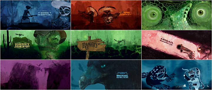
Rango is the name of the film. From looking at the film sequence I gather that the movie is a animated western which is aimed at a young audience because of the switch from humans to animal characters.

2 Who are the designers of the sequences? – This may be a company or an individual

The designer of the film end sequences is Henry Hobson. As well as making the Rango title sequences he has also directed a viral teaser for Resistance 3, and lately titles for 'Snow White and The Huntsman'.

3 How have the following media been used and what effects have been obtained or created by their use?

The style is supposed to founded on the 'old school' analogue hand work, such as intricate illustrations, woodcut art, and hand drawn typography.  I think that each one of the slides has its own monochrome color effect.
Rango (stills)


4 What do the sequences communicate to you or the audience?

The sequences was presented at the end of the film has a add on to the credits. It was seen as a total recap of the movie.


1 What is the title of the film and (very briefly) what do you think the film is about?

 Juno is the name of this movie. Looking at the title sequence the story of the movie is a little unclear. The story is about a girl dealing with teen pregnancy.

2 Who are the designers of the sequences? – This may be a company or an individual

Shadowplay Studio, who made the title sequence, was a motion graphics and visual effects studio founded by Ari Sachter-Zeltzer and Gareth Smith. Gareth Smith and Sachter-Zeltzer were graduates from the design department of UCLA. The studio discontinued in 2011. Former Shadowplay designers Gareth Smith and Jenny Lee started Smith & Lee Design in 2011.

3 How have the following media been used and what effects have been obtained or created by their use?


The pictures of the girl looked as if they were photocopied and then scanned again. To achieve sequence there was over 900 images of printing, hand-tracing, xeroxing, cutting and coloring of the main character Juno MacGuff walking through her neighbourhood. It seemed to me to be a job which should took a lot of time and patience.

4 What do the sequences communicate to you or the audience?

The sequences show the names producers screen writer and  a lot of other people who took part in the making of the movie. I can't really tell if these particular sequences reveal anything specific but the fact that Juno is the name of the main character and who that is.